Accessibility for Color Blindness
Did you know that roughly 1 in 12 men are affected by red-green color deficiency? That’s about 8 percent of men and between 4 and 5 percent of the population. In my observation, most people seem to have heard of it, but many underestimate how common it is. You probably know multiple color blind people, whether you’re aware or not.
What is color blindness?
Color vision deficiency, or color blindness, includes a variety of vision impairments that make it harder to see certain colors. Rather than a complete “blindness” for colors in general, most affected people are only “blind” to certain colors. The most common type by far is red-green color blindness with its different variations.
The cause is usually an inherited physiological condition of the eyes where one of the 3 types of photoreceptors (cones) for color perception is missing. Imagine an LED monitor that only has sub-pixels of red and blue or green and blue instead of RGB (red, green, blue). In most cases the number of photoreceptors is greatly reduced rather than missing altogether.


How does color blindness affect people?
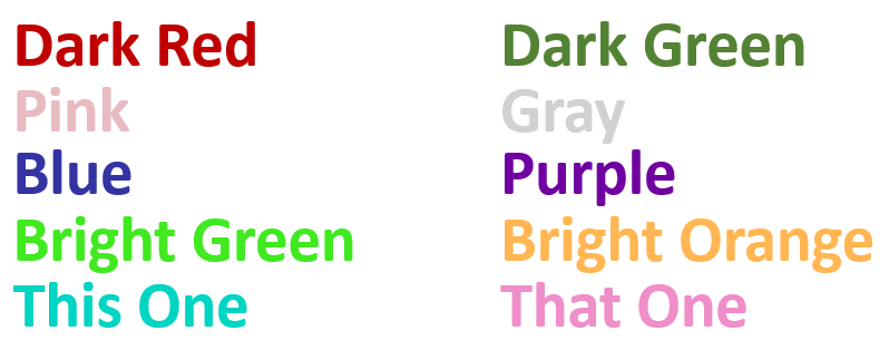
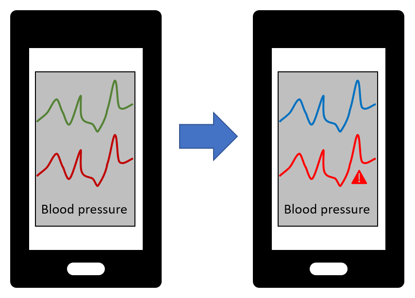
Most of the time not at all. But when it does, it’s annoying because it would be so easily preventable. Usually it’s some variation of information being encoded in colors. Which colors would you choose to signify good/bad, positive/negative, high/low? Exactly. Green and red. As a result, one has to ask a friend or colleague, or use an app or other technical tricks to correctly interpret the information.
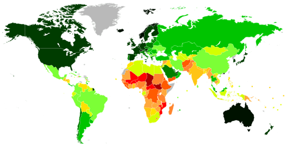
Image source: 3
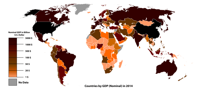
Image source: 4
That is pretty much the only way in which color blind people are negatively affected by it in everyday life: The artificially created situation where people choose red and green to signify opposites. In my opinion this is mainly an awareness problem. While most people know about red-green color blindness, saying “red and green” in a sentence does not tingle their spidey-sense. “Which colors do we want to use?” - “Hmm, how about red and green?” - “Sounds good!” Maybe they assume it’s some rare condition rather than 1 in 12 men. One per school class. Probably many of your friends and colleagues.
Accessibility for color blindness in games and other software
While many companies, developers, and designers are still embarrassingly unaware, parts of the software industry have realized that 5 percent of the user base is a pretty significant portion and have accommodated people with color blindness a long time ago. For example, where earlier games in the Call of Duty series used to mark the allies’ player names in green in multiplayer mode, newer versions (since about 2013) switched to displaying them in blue to make it easier to distinguish them from the enemies marked in red.
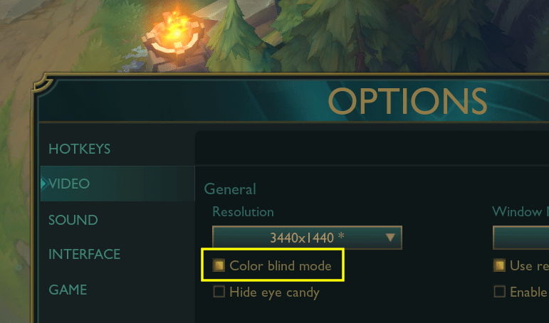
It seems to have been pretty much standard for about a decade now that many (multiplayer) games come with a color blind mode that can be enabled in the display settings. Some colors are then replaced with others for better contrast, mostly in information-dense areas like the UI and HUD elements, without compromising realism and aesthetics within the game world.
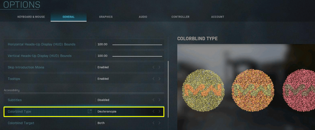
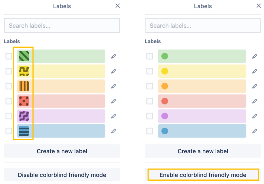
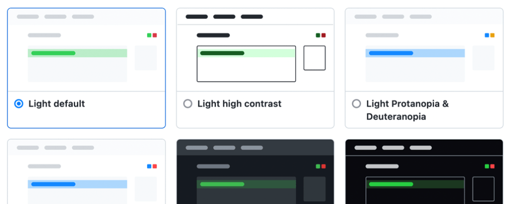
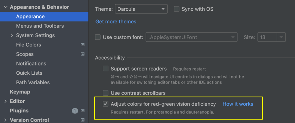
Similarly, if you’re a software developer, you might be familiar with color blind modes and themes in IntelliJ, GitHub, Trello, and other tools. In an ideal world more designers, but also developers (especially in the frontend) would be aware, and would either propose design changes or have the freedom to implement the necessary changes themselves.
-
Image source left: Q-lieb-in, CC BY-SA 4.0, via Wikimedia Commons ↩
-
Image source right: Tohaomg, CC BY-SA 4.0, via Wikimedia Commons ↩
-
https://commons.wikimedia.org/wiki/File:Countries_by_Human_Development_Index_%282021%29.svg, Allice Hunter, CC BY-SA 4.0, via Wikimedia Commons ↩
-
https://commons.wikimedia.org/wiki/File:Countries_by_GDP_%28Nominal%29_in_2014.svg, Ali Zifan, CC0 (Public Domain), via Wikimedia Commons ↩